Postings on science, wine, and the mind, among other things.
Do numbers always win?
Analyzing Wikipedia data on troop strengths and losses in 486 historical battles
It is said that God is always on the side of the big battalions.
God is not on the side of the big battalions, but on the side of those who shoot best.
The notion that "numbers always win," is a common refrain in military history. On the face of it, this seems like a very reasonable assertion: if you show up to a fight with 10 soldiers, and your enemy shows up with 1000, you're probably going to have a bad day. However, many factors beyond sheer troop counts influence the outcome of a battle. Training, experience, equipment, leadership, tactics, information, landscape, weather, and a host of other variables can significantly affect the course of military engagements. This raises the question: how much influence do numbers alone have? In simpler terms, what percentage of the time does the larger force prevail?
A partial answer to this question can be found in Lanchester's Laws. Devised by Fredrick Lanchester during World War I, these differential equations describe the strengths of opposing armies over the course of a battle as either a linear relationship (for ancient battles) or square (for "modern" warfare, in the WWI sense) of their troop counts. Although these laws have been applied to specific historical battles, it is not entirely clear to me whether they have received more extensive empirical validation. Moreover, even assuming that the laws are accurate, they only model one factor influencing the course of combat, so there is no way to know how much we should weigh them in comparison to other factors. Thus, we are still faced with the question of how much influence numbers have on victory.
The definitive way to answer this question would be through experimentation: pitch armies of varying sizes against one another repeatedly, and observe the results. Although appealingly direct, this approach has the drawback of being rather evil, given the amount of death and destruction it would entail.
An alternative to organizing hundreds of needless battles would be to simulate combat. This could be done either via computer or in comparatively safe training exercises. There's a lot to be said for this approach, but it would still require significant resources. Moreover, the results would only be as good as the simulations: if features of the simulated battles were not representative of real battles, then the results might not reflect real world trends.
A third approach to assessing the influence of numerical advantage on battles would be an observation method: examine the sizes of armies in historical battles, and how often the larger side won. This approach has the serious limitation of being correlational. Thus it could not really tell us whether army size caused victory. However, this approach has the compelling virtues of being easy and free, which is why I adopted it here.
Methods
Within the statistical programming language R, I used the WikipediaR package, a wrapper for the MediaWiki API, to "scrape" the Wikipedia pages associated with every historical battle indexed on the site, over 800 in all. I then used the rvest package to parse the HTML and extract out an "event box" featured in most such pages, which lists the vital statistics of the battle. These data include who won and lost, and the strengths and casualties of the opposing sides.
Unfortunately, the information in the boxes isn't formatted with the perfect consistency that would make it easy for a machine to read. For example, sometimes the winner was on the left side of the box, sometimes on the right, and the verbal description of the winner was often subtly different from how the sides were described. For example, a battle might be described as a "British victory" but list the "United Kingdom" as one of the belligerents. A simple text parser would have no way of knowing that "British" referred to the "United Kingdom" - this is semantic knowledge. The troop figures were also inconsistent, sometimes listing just the total number of soldiers, but other times listing each type of troop (infantry, cavalry, etc.) separately, or specifying force in terms of numbers of divisions or pieces of equipment (tanks, ships, planes, etc.).
Using the stringr package, I was able to parse the numbers associated with each side. Where multiple numbers were associated with each side, I took the first, maximum, median, and sum of these values, and averaged them together. I also filtered out small numbers (less than 500) as most of these did not refer to soldiers, but to other values such as division, equipment, ships, or Wikipedia citations. Although this approach guaranteed that I would make mistakes some of the time, by using these different estimators I hoped to avoid making frequent, grievous errors. Moreover, since the same approach was applied to both sides, it shouldn't bias subsequent results. I also applied the same approach to calculate each sides losses in battle.
Not all of the battles had force estimates, so by this time I was down to around 500. Since I could think of no effective alternative, I ultimately just bit the bullet and annotated by hand each of the battle's winners and losers (that is, I read the boxes and labelled the winners accordingly). I excluded battles with no clear winner, and classified battles by the tactical result instead of the strategic result when these conditions differed. Ultimately, I ended up with 486 battles to analyze.
Don't bring a knife to a gunfight
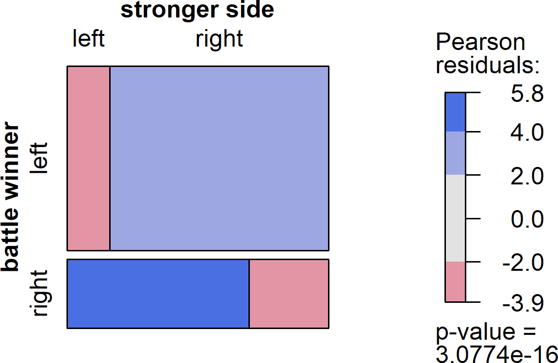
As it turns out, there is virtually zero relationship between the size of the armies that enter a battle, and which side emerges as the victor. A number of different analyses support this surprising conclusion. First, let's ask the simplest version of the question: how often does the larger army win? The result is reflected in the graph below, called a mosaic plot (generated using the vcd package). In a mosaic plot, the size of the rectangles reflects the frequency of events, with larger boxes representing greater frequencies. Thus, when you look at the graph below and you see that the top two boxes are larger than the bottom two boxes, this reflects the fact that Wikipedia editors are somewhat more likely to put the winner of a battle on the left side of the event box, and the loser on the right.
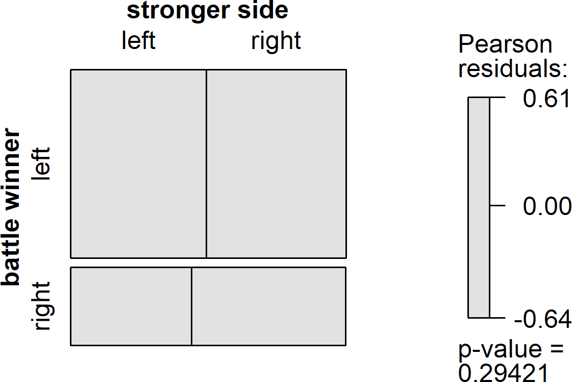
If the stronger side won battles more often than the weaker side, we would expect to the top left box and the bottom right box be disproportionately larger than the other boxes in their row and column. Additionally, these boxes would be color-coded blue, and the disproportionately small boxes would be color-coded red. Instead, we see a perfectly grey set of boxes, with those on the diagonal barely larger than those off the diagonal. On average, the larger army wins the battle just 51% of the time. The null result is formally supported by chi-square test, with the p-value shown in the graph above being well above the traditional .05 threshold for statistical significance.
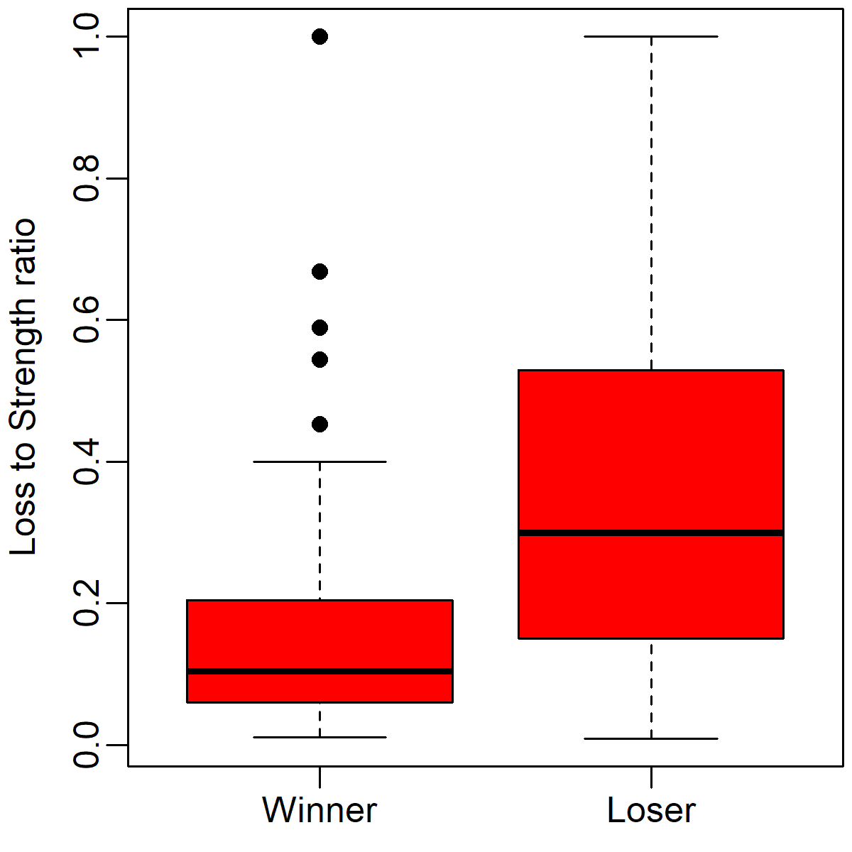
However, you may wonder whether this null result was caused by analyzing the data categorically - that is, what if a bunch of battles with only very small differences are hiding the influence of other battles with bigger strength differences? The box plot below illustrates the numerical distributions of strengths on the winning and losing side in each battle. The horizontal line in the middle indicate the median, the red box indicates where 75% of the observations live, the lines outside the box indicate 1.5 times the height of the box, and the circles indicate extreme observations. Army strength is plotted on a log scale on the y-axis. Thus, a value of 4 would translate to 10^4 = 10,000 soldiers.
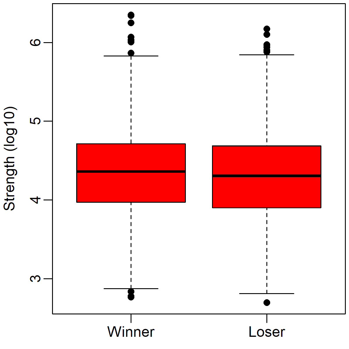
Although there is a small numerical difference between winners and losers, amounting to a median difference of about 2688 soldiers, this difference is not statistically significant (p = .54). Moreover, just by looking at the graph above, you can see that the distributions of winners' and losers' strengths is almost completely overlapping. This tendency repeats no matter how one analyzes the data. For instance, if one calculates a ratio of the larger army to the smaller army, the median is just 1.03:1 - barely different from equality (1:1).
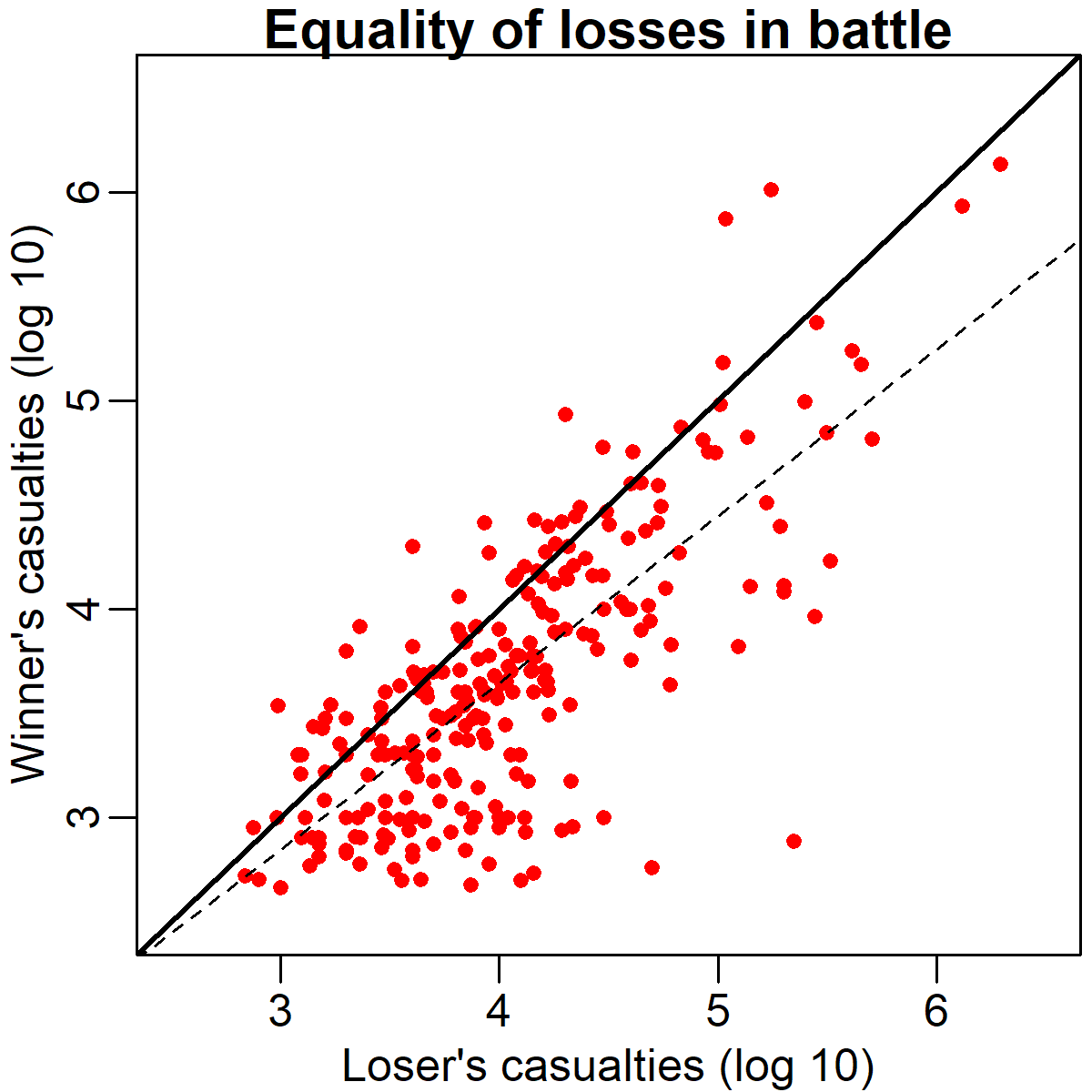
So, what is going on here? Although it's reasonable to think that army size might not be the sole determinant of victory, surely it must have some effect? The scatter plot below provides some hints about why we aren't seeing any such effect. In this plot, the size of the losing army is graphed along the x-axis (bottom) and the size of the winning army is graphed along the y-axis (left), again, after a log 10 transformation.
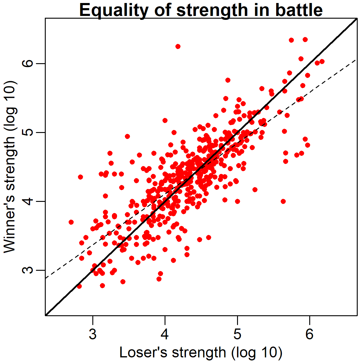
As you can see, there is a remarkably strong association between the winner's and loser's strength across battles (r = .78). The solid black diagonal line running through the plot indicates the point of equality in army size. As you can see, most of the points are remarkably close to this line. If the winning army was usually larger than the losing army, we would expect most of the points to be above the line instead. What might account for this relationship? There are at least two likely contributory factors:
One is the fact that the concept of "battle" is culturally constructed. Not every military engagement is a battle worthy of a Wikipedia page. Although there is no strict definition of a battle in terms of troop counts or other numerical quantities, in general to be considered a battle requires that a fight either be very large, very strategically important, or very surprising. As a result of this selection process, when we aggregate data on battles, we're getting a skewed picture of military engagements in general. Specifically, we're probably missing out on a lot of occasions on which large forces predictably crushed small ones.
The second reason why we might expect to see equality between winners and losers armies has more to do with military, rather than historiographic, considerations. That reason harkens back to the title of this section: the sound advice "don't bring a knife to a gunfight." In this case, the knife and the gun refer to army size: commanders generally don't like to engage their troops in a pitched battle when they are grossly outnumbered. Although there are certainly exceptions, historically many battles have been started in a somewhat consensual manner: when one side offers battle, the other side can accept or decline. Declining could mean maneuvering, retreating, staying behind fortifications, or simply surrendering. These various options have frequently been exercised in situations where one side has a huge numerical advantage over the other. Thus, again, we see disproportionately few cases of tiny armies crashing into huge armies, and the cases that we do see may be instances where other factors (such as technology or surprise) offset the stronger side's numerical advantage.
However, the scatter plot above does point to one interesting wrinkle in the general pattern we're seeing. The dashed line in the figure indicates the best-fit regression line. Although generally quite similar in slope to the solid equality line, the regression line significantly differs from equality. It does so because there are more points on the left side of the graph above the equality line, and more points on the right side of the graph below the equality line. In concrete terms, what this means is that although there is no significant numerical advantage *on average* there may be advantages or disadvantages to numerical superiority in very small or larger battles, respectively. This effect might be driven by smaller battles, where a smaller absolute advantage translates into a larger force ratio. It might also be driven by large battles of attrition during WWI, in which the defenders were often numerically inferior but had a considerable advantage due to entrenchment.
Fighting and winning 100 battles is not the ideal victory; the ideal victory is to win the war without fighting a single battle.
So what's the upshot of all of this? If a GI walked away from this with the impression that they could round up half a dozen of their buddies and go liberate North Korea because numbers don't matter, that would probably be the wrong take-away. A better lesson might be that, if you're in the middle of a fight that people are calling a "battle" then you shouldn't get overconfident because you outnumber the enemy, or lose heart because the enemy outnumbers you. It's also important to avoid making what's called the ecological inference fallacy, which involves (inappropriately) generalizing from one level of analysis (battles) to another (wars). It's quite possible that the side with the numerical advantage usually wins wars, even if they're no more likely to win any given battle in which they have proportional numerical superiority: a war is more than the sum of the battles that comprise it.
Nobody makes me bleed my own blood
War - h'uh! Yeah! What is it good for?
Analyzing the strengths of winning and losing armies across battles yielded a surprising result: the winner's force was no larger than the loser's on average, and the strengths of the opposing sides were highly correlated. This means that once battle is joined, a commander could not predict the outcome based on the sizes of the forces involved. What other information might help them make such predictions more accurately? As Edwin Starr pointed out, one of the few things war is good for is the "destruction of innocent lives." Morbid though it might be, perhaps analyzing the losses that each side suffers could yield more insight into who is more likely to win or lose a battle?
To answer this question, I applied the same text analysis approach described above to Wikipedia data on each side's losses in battle. Not all entries analyzed above had the right data, so these analyses were conducted in a subset of 253 of the 486 battles analyzed in the previous section. First I posed the question, is the side that suffered greater losses more likely to lose the battle? The mosaic plot below illustrates the answer: a resounding "yes!" In fact, the losing side suffered higher losses in nearly 80% of battles analyzed. This is reflected in the fact that the top right and bottom left boxes are disproportionately larger than the others in the plot below, and in the significant results of the accompanying chi-square test.
We can also see the relationship between casualties and victory in the box plot below. This boxplot illustrates the winning and losing armies' losses as proportions of their total strengths. As you can see, losers' losses are much high than winners' losses, with a relatively small amount of overlap between the two distributions.
The scatter plot below also illustrates the relationship between casualties and victory. This can be seen from the fact that the clear majority of battles are below the solid equality line that spans the diagonal of the figure. Interestingly, the relationship seems to get even stronger as the losses grow higher. This is represented by the increasing divergence between the equality line and the dashed regression line from left to right of the graph. This means that when one side suffers very heavy losses (in absolute terms) it's particularly unlikely to turn out to be the winner. Note that there is still a clear positive association between one's side's losses and the other's though.
Analyzing each side's losses in battle yields a clear relationship with victory: the side that loses least (troops) wins most (battles). Using correlational methods, we cannot know whether this is a causal mechanism (i.e., whether losing more soldiers causes one side to lose). This does seem like a reasonable causal chain, but it's worth pointing out that many casualties are often inflicted after one side has essentially already lost. During a rout, when one force has lost organization, there is typically an opportunity for the winning side to inflict disproportionate casualties, including taking many prisoners. Thus, victory may cause the disproportionate casualty counts, rather than vice-versa. Unfortunately, this possibility also makes it harder to use casualty information to predict outcomes. Battles are not instantaneous events, so if disproportionate casualties only come after one side is routed, then monitoring casualties earlier in the battle may not be very informative about who is likely to win in the end. With more fine-grained data about when casualties are inflicted it might be possible to test which account of the casualties-victory association is correct.
The Casualty Constant
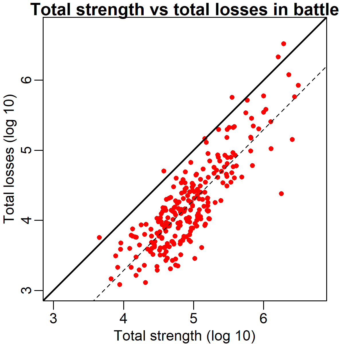
One incidental finding I happened upon while analyzing these data is that the total casualty rate in battle appears to be a relatively fixed proportionate of the total number of soldiers fighting, regardless of battle size. This finding is illustrated in the scatter plot below. This graph plots total strength (of both armies) against total losses (also of both armies). Necessarily nearly all points are below the solid diagonal equality line, meaning that not everyone was a casualty (the few points above the line are likely due to errors in the text parsing). However, more interestingly, the best fit regression line (dashed) is almost exactly parallel to the diagonal. This means that the fraction of soldiers killed, injured, captured or missing after a battle is constant regardless of whether hundreds or millions of them fought. The horizontal shift between the two lines is about .74, which on a log scale works out to a factor of 5.5. The typical losses in each battle amounted to ~26% of the total force, though as shown in the previous section, these losses came disproportionately from the losing side.
Conclusion
In this post, we used automatically aggregated data from Wikipedia to explore the relationship between army size (and casualties) and victory in battle. We observed that, surprisingly, there is essentially no relationship between which side started a battle with a larger army and which side won the battle. The data suggest that this might be because the only battles which are fought (or recorded as historically significant) tend to be fought between relatively equal forces. In contrast, we observed a very strong relationship between suffering higher casualties and losing a battle. However, it's not clear from these data whether casualties cause one side to lose, or whether losing causes that side to suffer casualties (or both, or neither). We also observed that casualties appear to be a relatively fixed across different battle sizes.
The R code used to aggregate, analyze, and visualize these data is available here. The hand-annotated battle data is available here. This project was partially completed in the course of the Princeton Social Neuroscience Lab's first lab hackathon earlier this month. Thank you for reading!

© 2018 Mark Allen Thornton. All rights reserved.