Postings on science, wine, and the mind, among other things.
Reddit retrospective: Conservatives in the 2016 election
A data-dive into online Republican sentiment

The 2016 election was unusual in many respects, but Trump's rise from reality-TV joke-candidate to president was almost certainly the biggest surprise. During the primaries, mainstream Republicans arguably waited too long to treat Trump as a serious threat, fighting amongst themselves until it became too late to resist his momentum. Edging out traditional conservatives one after another, Trump effectively hijacked their party with his own brand of nativist populism. He then rode a wave of anti-establishment sentiment, economic discontent, and outrageous bigotry to narrowly defeat Hillary Clinton in the general election.
Like most people, in the summer of 2015 I did not anticipate the meteoric rise of Trump. However, I was interested in how social media data - in particular, user comments on reddit - could be used to understand the political process. I had previously collected and explored a set of over 84 million reddit comments to understand what topics interested people on the site, and how these interests were related. Again using the Python Reddit API Wrapper (PRAW), I started a scrape-and-analyze script shortly before the first Republican primary debate. This script analyzed all of the comments on a number of subreddits in 15 minute increments from August 2015 through January 2017. For the purposes of the present post, I'll discuss the combined data from two mainstream conservative subreddits: r/conservative and r/republican. For each comment on these subreddits, I calculated three primary measures using text analysis: polarity, arousal, and word count. These measures are described in detail below, but click here to skip to discussion of how they relate to actual election events.
Polarity
Polarity refers to the valence of a comment: positive or negative. I used a primarily dictionary-based approach to calculate polarity. This means that for each comment, the script counted the appearances of positive and negative words from within a pre-defined dictionary. This dictionary of positive and negative words was taken from R's qdap package. I re-implemented this package's polarity calculations - which go somewhat beyond a dictionary approach to make use of context such as enhancers and negation - in Python. I also weighted each of the positive and negative words for the reddit context using the large comment set I alluded to above. Below you can see the time course of polarity on the conservative subreddits over the course of the election. Each point represents the average comment polarity for a single day. More positive days are shown in orange and more negative days in blue. The polarity scores on the Y-axis is auto-scaled (i.e. divided by their own standard deviation) but not mean-centered. The overlaid black curve represents a local regression which helps to visualize the broad trends in the data. Click the graph see it larger.
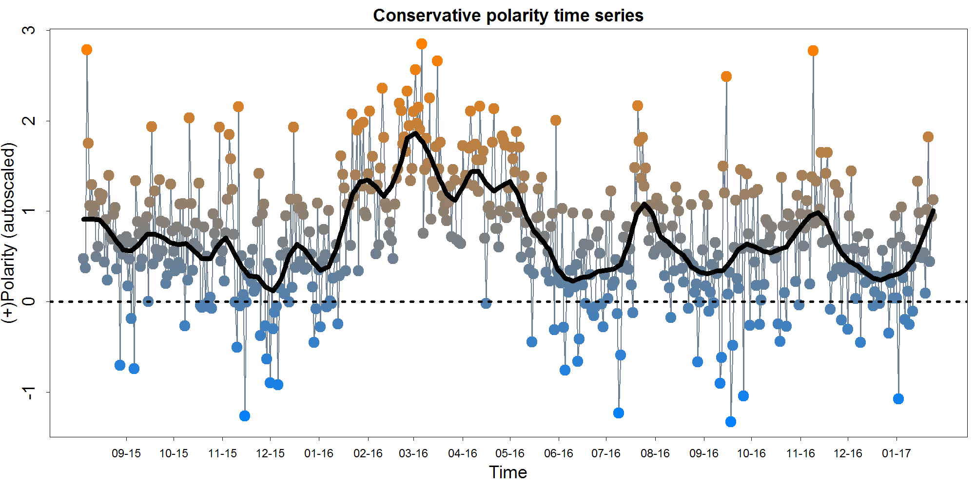
You might notice that the typical day is at least somewhat positive on average - this is probably less a reflection of particular positive of conservatives and more a reflection of a general positivity bias in language. Polarity declines slightly from the August 2015 until the beginning of 2016. It then rises to its all-time peak around the beginning of March. It falls back to a low point by mid-June 2016, and then displays peaks in August and November 2016. As we pull into 2017, polarity again seems to be on the rise.
How can we know if these data reflect meaningful trends rather than just random noise? One basic approach we can take is to examine whether this polarity measure predicts itself. A measure being correlated with itself is known as reliability, in the statistical sense of that word. Reliability is a prerequisite for virtually any form of usefulness: a measure which cannot predict itself cannot predict anything else either. In the graphs below, we examine to forms of correlation with self. First, in what is known as split-half reliability, we break the comments into two random halves and calculate daily polarity based on each half. We then correlate these halves together. The second graph reflects temporal auto-correlation. Essentially we take the polarity time-course shown above and correlate it with itself shifted over by 1 day. Thus this graph reflects how well we can predict tommorow's polarity based on today's.

As you can see, the reliability of our measure is far from perfect, but it is clearly not all noise either. The split-half reliability shown here may be a bit optimistic, given that there are likely unaccounted for factors such as multiple comments by the same person. Examining the autocorrelation at further time lags reveals that polarity on a given day robustly predicts later polarity up to at least 7 days out, accounting for variance shared with the intervening days. Thus we might hazard to infer that the average political news cycle on Reddit last for about a week.
Arousal
In this context, arousal does not refer to sexual arousal, as in lay parlance, but rather to emotional/physiological arousal (or intensity), as described in the Circumplex Theory of Affect. This is a dimension of emotion seldom considered in automated text analysis, so I invented my own measure. It relies on enhancer counts ("really" "very" etc.), absolute valued polarity, exclamation points, ALL CAPS, and swear words. The plotting conventions for the time course below are as previously described above for polarity.
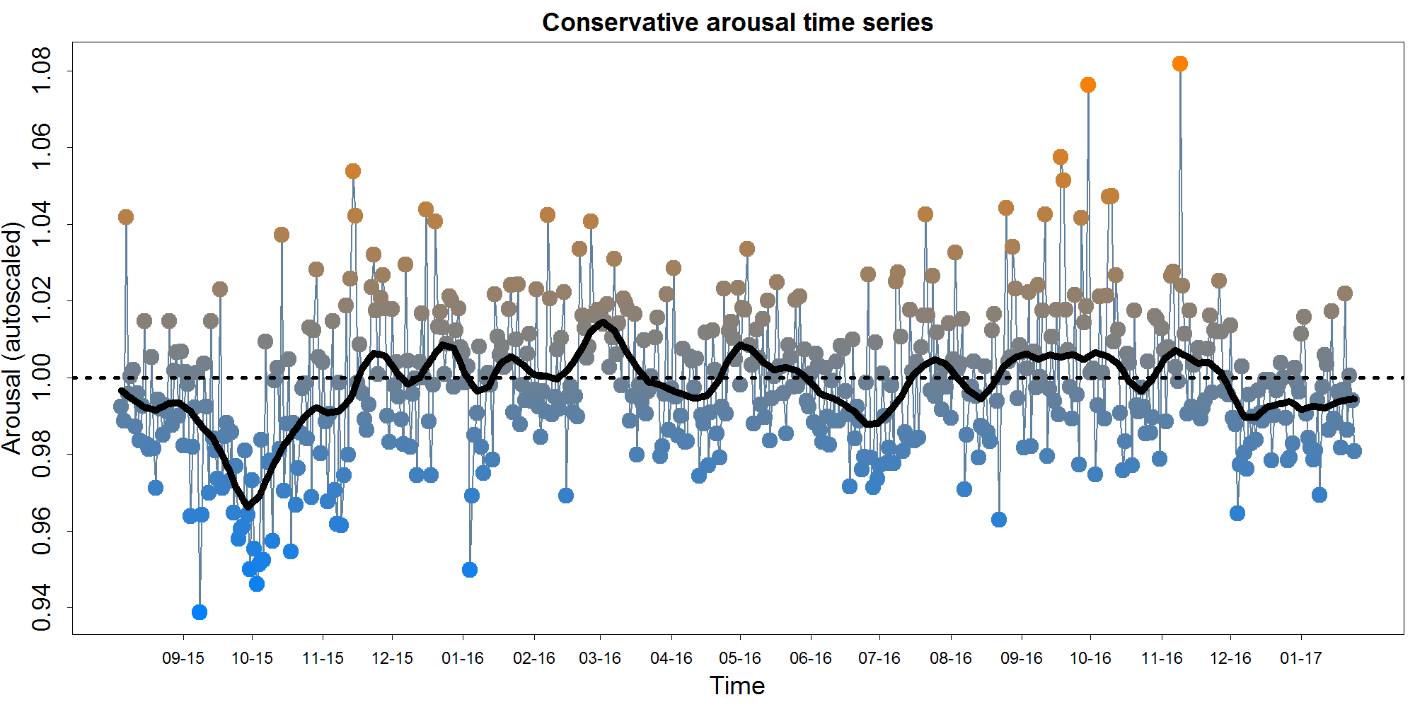
As you can see, there's considerably less movement on the arousal graph than the polarity graph. This probably at least partially because my novel arousal measure isn't as good as the established polarity measures. However, we can see a large negative peak around the beginning of October, 2015, as well as two single-day extremes in October and November 2016.
Word number
Measuring word count is fairly self-explanatory. I used Python's Natural Language Toolkit to parse sentences and then words (for this measure and all others). The hope was that this measure would reflect the nature of the discourse, with longer posts indicating more thoughtful discussion.
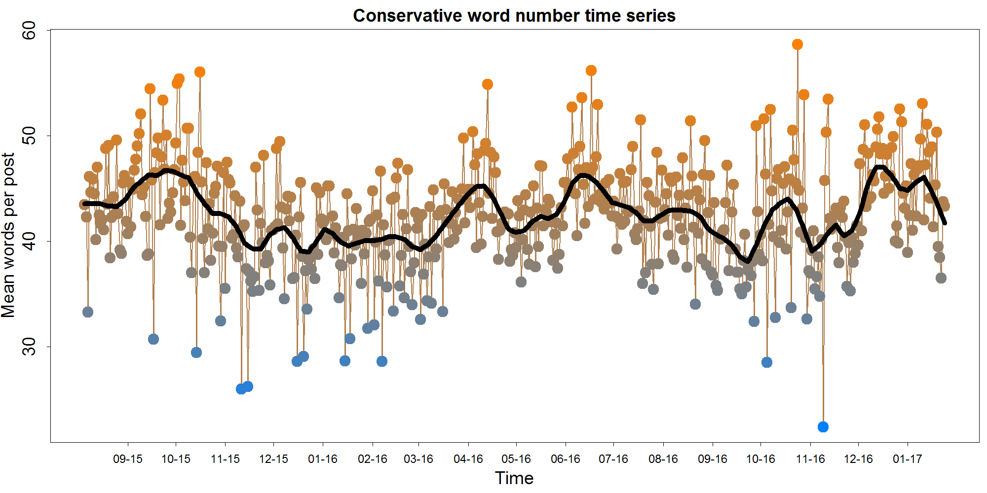
The average comment word length on the most days was in the low 40s. Notable peaks can be seen around late September, 2015, April 2016, late June 2015, late October 2016, and December/January 2017.
Post frequency
While not a text-based measure per se, the number of comments is also worth examining. Comment number can offer insight into general interest levels across the election season, as well as helping to calibrate the reliability of the measures in the other graphs.
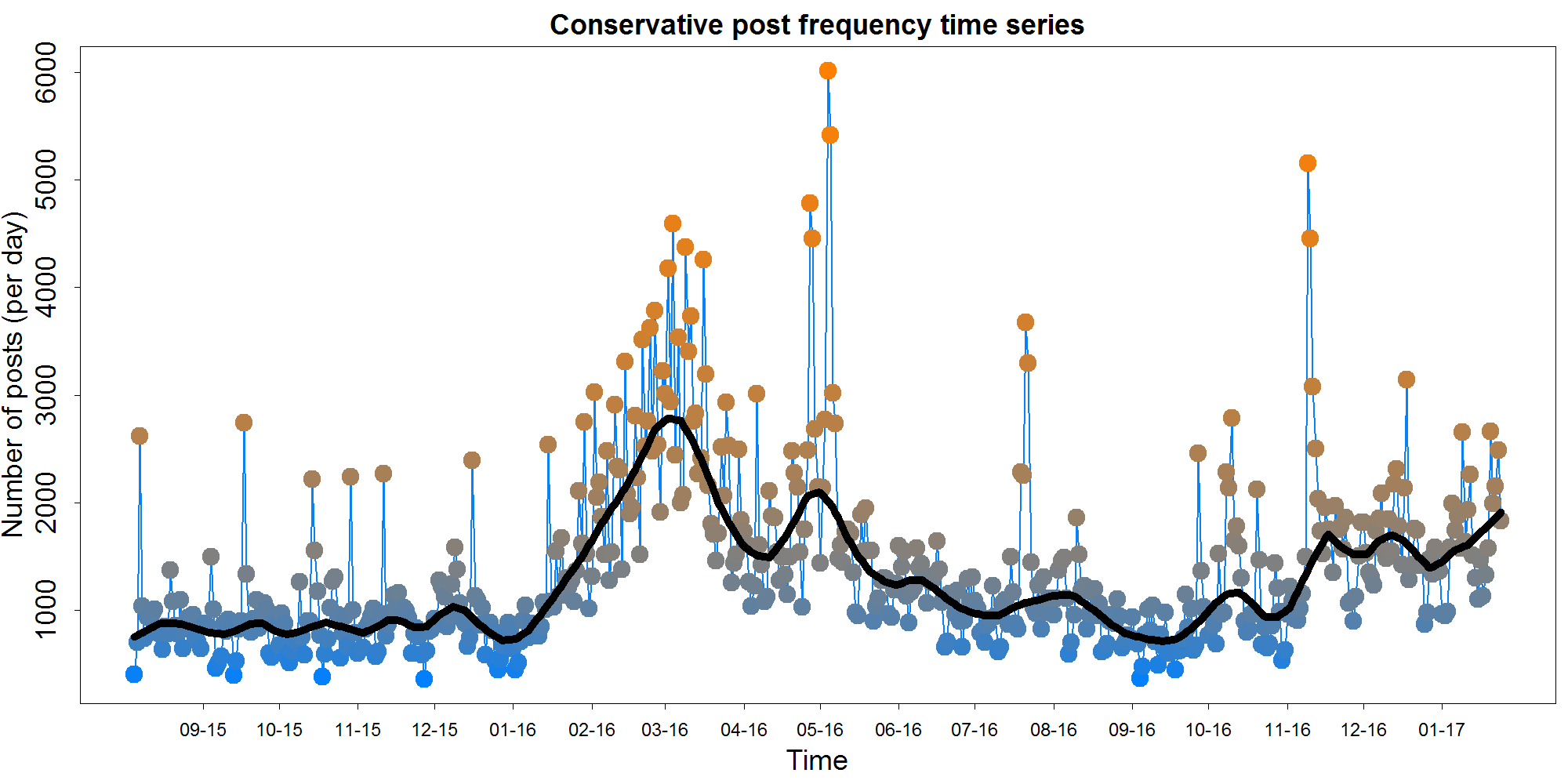
On most days, slightly fewer than 750-1000 comments were made on r/conservative and r/republican. However, a large double-peak can be seen in the middle of the graph, peaking around the beginning of March 2016 and again in May 2016. Comment frequency also appears to pick up after the election itself.
Relationships between variables
How do these variables relate to one another? The scatterplot matrix below illustrates the descriptive relationships between comment number, word count, polarity and arousal. It also displays the univariate distributions of each of these measures along the diagonal. Each data point is again a day, rather than a comment.
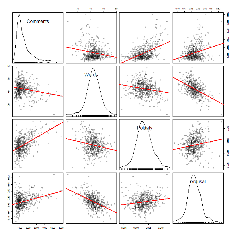
Comment number covaries positively with arousal, and even more so with polarity - that is, people comment more when they are happy and excited (though this is probably a common-cause situation). Interestingly, word count is highly negatively correlated with arousal - this makes sense in a certain light, if we expect short, high energy exclamations when people are aroused.
Combined time course with election events
So how are these text-based measures on reddit associated with election events? In the graph below, the standardized local regression curves from the four measures above are combined into a single graph. The dates of major election events - taken from Wikipedia's 2016 election timeline - are plotted using dotted vertical lines. In addition to plotting major events in general, I also tried to select the events most aligned with peaks in the time courses. Again, click the graph to see it larger.
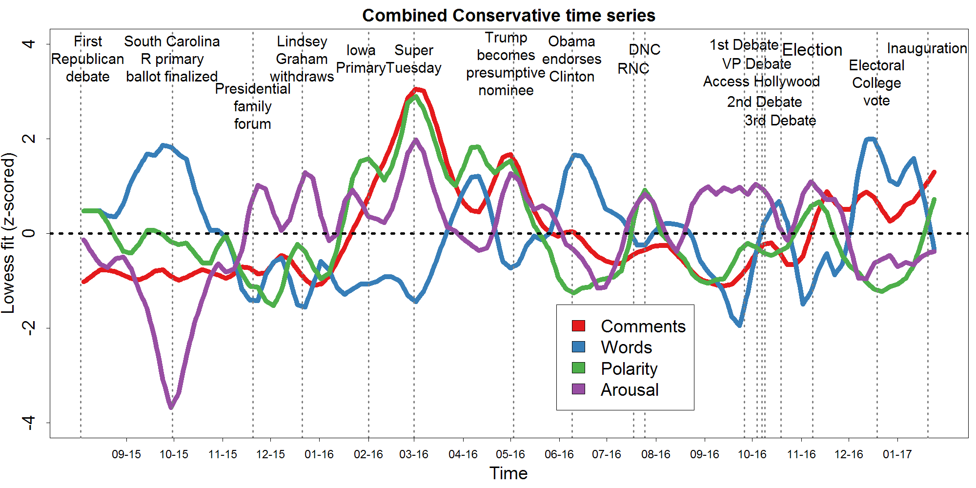
A number of major events seem to coincide quite precisely with swings in the data. The most dramatic case of this was Super Tuesday, which witnessed all-time peaks in polarity, arousal, and comment number. The same three variables also rise together shortly thereafter when Trump became the presumptive Republican nominee. It is puzzling that the major motion in the graph all appears to center around the Republican primaries rather than the general election. Super Tuesday was a much bigger day for these subreddits then the period around November 8th. Since these subreddits pre-dated the rise of Trump, and his supporters' particular subreddit r/the_donald, it seems plausible that their emotional responses represent mainstream Republicans and traditional conservatives rather than Trump's partisans.
A very different profile is observed earlier in the election time when the South Carolina primary ballots were fixed, finalizing the plausible candidate list. This moment corresponded to a massive drop in arousal, paired with a proliferation of long-winded comments. This profile appears to recapitulate to some extent when Hillary became the presumptive Democratic nominee and after the election concluded. It reverses - with high arousal and low word count - during the period directly before the debates.
Interestingly, the Trump's debate performances and the release of the Access Hollywood tape - which both hurt him in the poles - did not seem to drive down comment polarity on reddit. Given that Trump eventually rebounded from these setbacks, one interpretation is that the non-response of the anonymous redditor users was more revealing of Republican preferences then their publicly expressed opinions.
In sum, at least some election results do seem to be reflected in the text of redditors' comments on conservative subreddits. In the future, it might be possible to refine this analysis and build it into a live "barometer" of political mood. Given the increasing problems with traditional phone-based surveys, this could be one of several complementary measures that help to pick up the methodological slack.
The data used to create this post is available here, the R code for plotting is here, and my Python adaptation of the qdap package's polarity calculation is available here.

© 2017 Mark Allen Thornton. All rights reserved.